The following post is a section of the book '
Raspberry Pi: Measure, Record, Explore'. The entire book can be downloaded in pdf format for free from Leanpub or you can read it online
here.
Since this post is a snapshot in time. I recommend that you
download a copy of the book which is updated frequently to improve and expand the content.
---------------------------------------
This is the third of three posts working through a project looking at Measuring Recording and Exploring information via the GPIO pins on the Raspberry Pi. The second can be found here.
Explore
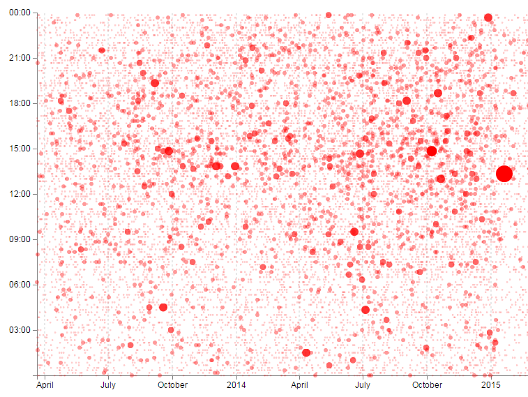
This section has a working solution for presenting data from events,. This is done via a scatter-plot type matrix (hereby referred to as the ‘catter-plot’ as it involves measuring cats going through cat doors) that is slightly different to those that would normally be used. Typically a scatter-plot with use time on the x axis and a value on the Y axis. This example will use the time of day on the X axis, independent of the date and the Y axis will represent the date independent of the time of day. The end result is a scatter-plot where activities that occur on a specific day are seen on a horizontal line and the time of day that these activities occur can form a pattern that the brain can determine fairly easily.
 |
| The ‘Cattterplot’ Graph |
We can easily see that wherever the cats are between approximately 7:30 and 11am they’re not likely to be using the cat door. However, something happens at around 3:30pm and it’s almost certain that they will be coming through the cat flap.
This is a slightly more complex use of JavaScript and d3.js specifically but it is a great platform that demonstrates several powerful techniques for manipulating and presenting data.
It has the potential to be coupled with additional events that could be colour coded and / or they could be sized according to frequency.
The Code
The following code is a PHP file that we can place on our Raspberry Pi’s web server (in the /var/www directory) that will allow us to view all of the results that have been recorded in the temperature directory on a graph;
The full code can be found in the code samples bundled with this book (events.php).
<?php

$hostname = 'localhost';
$username = 'pi_select';
$password = 'xxxxxxxxxx';

try {
    $dbh = new PDO("mysql:host=$hostname;dbname=measurements",
                               $username, $password);

    /*** The SQL SELECT statement ***/
    $sth = $dbh->prepare("
       SELECT dtg
       FROM `events`
    ");
    $sth->execute();

    /* Fetch all of the remaining rows in the result set */
    $result = $sth->fetchAll(PDO::FETCH_ASSOC);

    /*** close the database connection ***/
    $dbh = null;
}

catch(PDOException $e)
    {
        echo $e->getMessage();
    }

$json_data = json_encode($result);

?>
<!DOCTYPE html>
<meta charset="utf-8">
<style>

body { font: 12px sans-serif; }

.axis path,
.axis line {
  fill: none;
  stroke: grey;
  shape-rendering: crispEdges;
}

.dot { stroke: none; fill: steelblue; }

.grid .tick { stroke: lightgrey; opacity: 0.7; }
.grid path { stroke-width: 0;}

</style>
<body>
<script src="http://d3js.org/d3.v3.min.js"></script>
<script>

// Get the data
<?php echo "data=".$json_data.";" ?>

// Parse the date / time formats
parseDate = d3.time.format("%Y-%m-%d").parse;
parseTime = d3.time.format("%H:%M:%S").parse;

data.forEach(function(d) {
    dtgSplit = d.dtg.split(" ");     // split on the space
    d.date = parseDate(dtgSplit[0]); // get the date seperatly
    d.time = parseTime(dtgSplit[1]); // get the time separately
});

// Get the number of days in the date range to calculate height
var oneDay = 24*60*60*1000; // hours*minutes*seconds*milliseconds
var dateStart = d3.min(data, function(d) { return d.date; });
var dateFinish = d3.max(data, function(d) { return d.date; });
var numberDays = Math.round(Math.abs((dateStart.getTime() -
                           dateFinish.getTime())/(oneDay)));

var margin = {top: 40, right: 20, bottom: 30, left: 100},
    width = 600 - margin.left - margin.right,
    height = numberDays * 8;

var x = d3.time.scale().range([0, width]);
var y = d3.time.scale().range([0, height]);

var xAxis = d3.svg.axis()
    .scale(x)
    .orient("bottom")
    .ticks(7)
    .tickFormat(d3.time.format("%H:%M"));

var yAxis = d3.svg.axis()
    .scale(y)
    .orient("left")
    .ticks(7,0,0);

var svg = d3.select("body")
    .append("svg")
        .attr("width", width + margin.left + margin.right)
        .attr("height", height + margin.top + margin.bottom)
    .append("g")
        .attr("transform", "translate(" + margin.left + ","
                                        + margin.top + ")");

// State the functions for the grid
function make_x_axis() {
    return d3.svg.axis()
      .scale(x)
      .orient("bottom")
      .ticks(7)
}

// Set the domains
x.domain([new Date(1899, 12, 01, 0, 0, 1),
          new Date(1899, 12, 02, 0, 0, 0)]);
y.domain(d3.extent(data, function(d) { return d.date; }));

// tickSize: Get or set the size of major, minor and end ticks
svg.append("g").classed("grid x_grid", true)
    .attr("transform", "translate(0," + height + ")")
    .style("stroke-dasharray", ("3, 3, 3"))
    .call(make_x_axis()
        .tickSize(-height, 0, 0)
        .tickFormat(""))

// Draw the Axes and the tick labels
svg.append("g")
    .attr("class", "x axis")
    .attr("transform", "translate(0," + height + ")")
    .call(xAxis)
  .selectAll("text")
    .style("text-anchor", "middle");

svg.append("g")
    .attr("class", "y axis")
    .call(yAxis)
  .selectAll("text")
    .style("text-anchor", "end");

// draw the plotted circles
svg.selectAll(".dot")
    .data(data)
  .enter().append("circle")
    .attr("class", "dot")
    .attr("r", 4.5)
    .style("opacity", 0.5)
    .attr("cx", function(d) { return x(d.time); })
    .attr("cy", function(d) { return y(d.date); });

</script>
</body>
The graph that will look a little like this (except the data will be different of course).
 |
| The ‘Cattterplot’ Graph |
This is a fairly basic graph (i.e, there is no title or labeling of axis).
The code will automatically try to collect as many events as are in the database, so depending on your requirements we may need to vary the query. As some means of compensation it will automatically increase the vertical size of the graph depending on how many days the data spans.
PHP
The PHP block at the start of the code is mostly the same as our example code for our single temperature measurement project. The significant difference however is in the select statement.
       SELECT dtg
       FROM `events`
       LIMIT 0,900
Here we are only returning a big list of date / time values.
CSS (Styles)
There are a range of styles that are applied to the elements of the graphic.
body { font: 12px sans-serif; }

.axis path,
.axis line {
  fill: none;
  stroke: grey;
  shape-rendering: crispEdges;
}

.dot { stroke: none; fill: steelblue; }

.grid .tick { stroke: lightgrey; opacity: 0.7; }
.grid path { stroke-width: 0;}
We set a default text font and size, some formatting for our axes and grid lines and the colour and type of outline (none) that our dots for our events have.
JavaScript
The code has very similar elements to our single temperature measurement script and comparing both will show us that we are doing similar things in each graph. Interestingly, this code mixes the sequence of some of the ‘blocks’ of code. This is in order to allow the dynamic adjustment of the vertical size of the graph.
The very first thing we do with our JavaScript is to use our old friend PHP to declare our data;
<?php echo "data=".$json_data.";" ?>
Then we declare the two functions we will use to format our time values;
parseDate = d3.time.format("%Y-%m-%d").parse;
parseTime = d3.time.format("%H:%M:%S").parse;
parseDate will format and date values and parseTime will format any time values.
Then we cycle through our data using a forEach statement;
data.forEach(function(d) {
    dtgSplit = d.dtg.split(" ");     // split on the space
    d.date = parseDate(dtgSplit[0]); // get the date seperatly
    d.time = parseTime(dtgSplit[1]); // get the time seperatly
});
In this loop we split our dtg value into date and time portions and then use our parse statements to ensure that they are correctly formatted.
We then do a little bit of date / time maths to work out how many days are between the first day in our range of data and the last day;
var oneDay = 24*60*60*1000; // hours*minutes*seconds*milliseconds
var dateStart = d3.min(data, function(d) { return d.date; });
var dateFinish = d3.max(data, function(d) { return d.date; });
var numberDays = Math.round(Math.abs((dateStart.getTime() -
                           dateFinish.getTime())/(oneDay)));
We set up the size of the graph and the margins (this is where we adjust the height of the graph depending on the number of days);
var margin = {top: 40, right: 20, bottom: 30, left: 100},
    width = 600 - margin.left - margin.right,
    height = numberDays * 8;
The scales and ranges for both axes are both time based in this example;
var x = d3.time.scale().range([0, width]);
var y = d3.time.scale().range([0, height]);
And we set up the x axis and y axis accordingly;
var xAxis = d3.svg.axis()
    .scale(x)
    .orient("bottom")
    .ticks(7)
    .tickFormat(d3.time.format("%H:%M"));

var yAxis = d3.svg.axis()
    .scale(y)
    .orient("left")
    .ticks(7,0,0);
We then create our svg container with the appropriate with and height taking into account the margins;
var svg = d3.select("body")
    .append("svg")
        .attr("width", width + margin.left + margin.right)
        .attr("height", height + margin.top + margin.bottom)
    .append("g")
        .attr("transform", "translate(" + margin.left + ","
                                        + margin.top + ")");
Then we declare a special function that we will use to make our grid;
function make_x_axis() {
    return d3.svg.axis()
      .scale(x)
      .orient("bottom")
      .ticks(7)
}
Essentially we will be creating another x axis with lines that extend the full height of the graph.
Our domains are set in a bit of an unusual way since our time variables have no associated date. Therefore we tell the range to fall over a suitable time range that spans a single day
x.domain([new Date(1899, 12, 01, 0, 0, 1),
          new Date(1899, 12, 02, 0, 0, 0)]);
y.domain(d3.extent(data, function(d) { return d.date; }));
The y domain can exist as normal although is (unusually) a time scale and not ordinal.
Our grid is added as a separate axis with really tall ticks (tickSize), no text values (tickFormat) and with a dashed line (stroke-dasharray);
svg.append("g").classed("grid x_grid", true)
    .attr("transform", "translate(0," + height + ")")
    .style("stroke-dasharray", ("3, 3, 3"))
    .call(make_x_axis()
        .tickSize(-height, 0, 0)
        .tickFormat(""))
Then we do the mundane adding of the axes and plotting the circles;
Wonderful! And as an added bonus you can also find the file ‘events-tips.php’ in the downloads with the book. This file is much the same as the one we have just explained, but also includes a tool-tip feature that shows the time and date of an individual point when our mouse moves over the top of it.
 |
| The ‘Cattterplot’ Graph with tool tips! |
If you want a closer explanation for this piece of code, download a copy of
D3 Tips and Tricks for this and a whole swag of other information.
The post above (and heaps of other stuff) is in the book '
Raspberry Pi: Measure, Record, Explore' that can be downloaded for free (or donate if you really want to :-)).