
Since this post is a snapshot in time. I recommend that you download a copy of the book which is updated frequently to improve and expand the content.
---------------------------------------
This is the first part of the last of three posts working through a project looking at Measuring Recording and Exploring system information from and with the Raspberry Pi.Explore
This section has a working solution for presenting real-time, dynamic information from your Raspberry Pi. This is an interesting visualization, because it relies on two scripts in order to work properly. One displays the graphical image in our browser, and the other determines the current state of the data from our Pi, or more specifically from our database. The browser is set up to regularly interrogate our data gathering script to get the values as they change. This is an effective demonstration of using dynamic visual effects with changing data.
The final form of the graph should look something like the following;
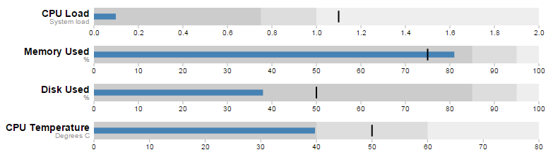 |
| Bullet Graphs |
The Bullet Graph
One of the first d3.js examples I ever came across (back when it was called Protovis) was one with bullet charts (or bullet graphs). They struck me straight away as an elegant way to represent data by providing direct information and context. With it we are able to show a measured value, labelling (and sub-labels), ranges and specific markers. As a double bonus it is a relatively simple task to get them to update when our data changes. If you are interested in seeing a bit more of an overview with some examples, check out the book ‘D3 Tips and Tricks’.
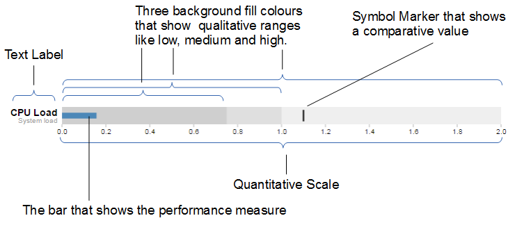
The Bullet Graph Design Specification was laid down by Stephen Frew as part of his work with Perceptual Edge.
Using his specification we can break down the components of the chart as follows.
 |
| Bullet Chart Specification |
Text label:
Identifies the performance measure (the specific measured value) being represented.
Quantitative scale:
A scale that is an analogue of the scale on the x axis of a two dimensional xy graph.
Performance measure:
The specific measured value being displayed. In this case the system load on our CPU.
Comparative marker:
A reference symbol designating a measurement such as the previous day’s high value (or similar).
Qualitative ranges:
These represent ranges such as low, medium and high or bad, satisfactory and good. Ideally there would be no fewer than two and no more than 5 of these (for the purposes of readability).
Understanding the specification for the chart is useful, because it’s also reflected in the way that the data for the chart is structured.
For instance, If we take the CPU load example above, the data can be presented (in JSON) as follows;
[
  {
    "title":"CPU Load",
    "subtitle":"System Load",
    "ranges":[0.75,1,2],
    "measures":[0.17],
    "markers":[1.1]
  }
]
Here we an see all the components for the chart laid out and it’s these values that we will load into our D3 script to display.
The Code
As was outlined earlier, the code comes in two parts. The HTML / JavaScript display code and the PHP gather the data code.
First we’ll look at the HTML web page.
HTML / JavaScript
We’ll move through the explanation of the code in a similar process to the other examples in the book. Where there are areas that we have covered before, I will gloss over some details on the understanding that you will have already seen them explained in an earlier section. This code can be downloaded as sys_info.html with the code examples available with the book.
Here is the full code
<!DOCTYPE html>
<meta charset="utf-8">
<style>
<style>

body {
  font-family: "Helvetica Neue", Helvetica, Arial, sans-serif;
  margin: auto;
  padding-top: 40px;
  position: relative;
  width: 800px;
}

.bullet { font: 10px sans-serif; }
.bullet .marker { stroke: #000; stroke-width: 2px; }
.bullet .tick line { stroke: #666; stroke-width: .5px; }
.bullet .range.s0 { fill: #eee; }
.bullet .range.s1 { fill: #ddd; }
.bullet .range.s2 { fill: #ccc; }
.bullet .measure.s0 { fill: steelblue; }
.bullet .title { font-size: 14px; font-weight: bold; }
.bullet .subtitle { fill: #999; }

</style>
<script src="http://d3js.org/d3.v3.min.js"></script>
<script src="bullet.js"></script>
<script>

var margin = {top: 5, right: 40, bottom: 20, left: 130},
    width = 800 - margin.left - margin.right,
    height = 50 - margin.top - margin.bottom;

var chart = d3.bullet()
    .width(width)
    .height(height);

d3.json("sys_info.php", function(error, data) {
  var svg = d3.select("body").selectAll("svg")
      .data(data)
    .enter().append("svg")
      .attr("class", "bullet")
      .attr("width", width + margin.left + margin.right)
      .attr("height", height + margin.top + margin.bottom)
    .append("g")
      .attr("transform",
            "translate(" + margin.left + "," + margin.top + ")")
      .call(chart);

  var title = svg.append("g")
      .style("text-anchor", "end")
      .attr("transform", "translate(-6," + height / 2 + ")");

  title.append("text")
      .attr("class", "title")
      .text(function(d) { return d.title; });

  title.append("text")
      .attr("class", "subtitle")
      .attr("dy", "1em")
      .text(function(d) { return d.subtitle; });

  setInterval(function() {
    updateData();
 }, 60000);

});

function updateData() {
    d3.json("sys_info.php", function(error, data) {
        d3.select("body").selectAll("svg").datum(function (d, i) {
            d.ranges = data[i].ranges;
            d.measures = data[i].measures;
            d.markers = data[i].markers;
            return d;})
            .call(chart.duration(1000));
    });
}

</script>
</body>
 |
It will become clearer in the process of going through the code below, but as a teaser, it is worth noting that while the code that we will modify is as presented above, we are employing a separate script
bullet.js to enable the charts. |
The first block of our code is the start of the file and sets up our HTML.
<!DOCTYPE html>
<meta charset="utf-8">
<style>
This leads into our style declarations.
body {
  font-family: "Helvetica Neue", Helvetica, Arial, sans-serif;
  margin: auto;
  padding-top: 40px;
  position: relative;
  width: 800px;
}

.bullet { font: 10px sans-serif; }
.bullet .marker { stroke: #000; stroke-width: 2px; }
.bullet .tick line { stroke: #666; stroke-width: .5px; }
.bullet .range.s0 { fill: #eee; }
.bullet .range.s1 { fill: #ddd; }
.bullet .range.s2 { fill: #ccc; }
.bullet .measure.s0 { fill: steelblue; }
.bullet .title { font-size: 14px; font-weight: bold; }
.bullet .subtitle { fill: #999; }
We declare the (general) styling for the chart page in the first instance and then we move on to the more interesting styling for the bullet charts.
The first line
.bullet { font: 10px sans-serif; } sets the font size.
The second line sets the colour and width of the symbol marker. Feel free to play around with the values in any of these properties to get a feel for what you can do. Try this for a start;
.bullet .marker { stroke: red; stroke-width: 10px; }
We then do a similar thing for the tick marks for the scale at the bottom of the graph.
The next three lines set the colours for the fill of the qualitative ranges.
.bullet .range.s0 { fill: #eee; }
.bullet .range.s1 { fill: #ddd; }
.bullet .range.s2 { fill: #ccc; }
You can have more or fewer ranges set here, but to use them you also need the appropriate values in your data file. We will explore how to change this later.
The next line designates the colour for the value being measured.
.bullet .measure.s0 { fill: steelblue; }
Like the qualitative ranges, we can have more of them, but in my personal opinion, it starts to get a bit confusing.
The final two lines lay out the styling for the label.
The next block of code loads the JavaScript files.
<script src="http://d3js.org/d3.v3.min.js"></script>
<script src="bullet.js"></script>
In this case it’s d3 and
bullet.js. We need to load bullet.js as a separate file since it exists outside the code base of the d3.js ‘kernel’. The file itself can be found here and it is part of a wider group of plugins that are used by d3.js. Place the file in the same directory as the sys_info.html page for simplicities sake.
Then we get into the JavaScript. The first thing we do is define the size of the area that we’ll be working in.
var margin = {top: 5, right: 40, bottom: 20, left: 130},
    width = 800 - margin.left - margin.right,
    height = 50 - margin.top - margin.bottom;
Then we define the chart size using the variables that we have just set up.
var chart = d3.bullet()
    .width(width)
    .height(height);
The other important thing that occurs while setting up the chart is that we use the
d3.bullet function call to do it. The d3.bullet function is the part that resides in the bullet.js file that we loaded earlier. The internal workings of bullet.js are a window into just how developers are able to craft extra code to allow additional functionality for d3.js.
Then we load our JSON data with our external script (which we haven’t explained yet) called
sys_info_php. As a brief spoiler, sys_info.php is a script that will query our database and return the latest values in a JSON format. Hence, when it is called as below, it will provide correctly formatted data.d3.json("sys_info.php", function(error, data) {
The next block of code is the most important IMHO, since this is where the chart is drawn.
var svg = d3.select("body").selectAll("svg")
    .data(data)
  .enter().append("svg")
    .attr("class", "bullet")
    .attr("width", width + margin.left + margin.right)
    .attr("height", height + margin.top + margin.bottom)
  .append("g")
    .attr("transform",
          "translate(" + margin.left + "," + margin.top + ")")
    .call(chart);
However, to look at it you can be forgiven for wondering if it’s doing anything at all.
We use our
.select and .selectAll statements to designate where the chart will go (d3.select("body").selectAll("svg")) and then load the data as data(.data(data)).
We add in a svg element (
.enter().append("svg")) and assign the styling from our css section (.attr("class", "bullet")).
Then we set the size of the svg container for an individual bullet chart using
.attr("width", width + margin.left + margin.right) and .attr("height", height + margin.top + margin.bottom).
We then group all the elements that make up each individual bullet chart with
.append("g") before placing the group in the right place with.attr("transform", "translate(" + margin.left + "," + margin.top + ")").
Then we wave the magic wand and call the
chart function with .call(chart); which will take all the information from our data file ( like theranges, measures and markers values) and use the bullet.js script to create a chart.
The reason I made the comment about the process looking like magic is that the vast majority of the heavy lifting is done by the
bullet.jsfile. Because it’s abstracted away from the immediate code that we’re writing, it looks simplistic, but like all good things, there needs to be a lot of complexity to make a process look simple.
We then add the titles.
  var title = svg.append("g")
      .style("text-anchor", "end")
      .attr("transform", "translate(-6," + height / 2 + ")");

  title.append("text")
      .attr("class", "title")
      .text(function(d) { return d.title; });

  title.append("text")
      .attr("class", "subtitle")
      .attr("dy", "1em")
      .text(function(d) { return d.subtitle; });
We do this in stages. First we create a variable
title which will append objects to the grouped element created above (var title = svg.append("g")). We apply a style (.style("text-anchor", "end")) and transform to the objects (.attr("transform", "translate(-6," + height / 2 + ")");).
Then we append the
title and subtitle data (from our JSON file) to our chart with a modicum of styling and placement.
Lastly (inside the main part of the code) we set up a repeating function that calls another function (
updateData) every 60000ms. (every minute) setInterval(function() {
updateData();
}, 60000);
Lastly we declare the function (
updateData) which reads in our JSON file again, selects all the svg elements then updates all the .ranges,.measures and .markers data with whatever was in the file. Then it calls the chart function that updates the bullet charts (and it lets the change take 1000 milliseconds).function updateData() {
d3.json("sys_info.php", function(error, data) {
d3.select("body").selectAll("svg")
.datum(function (d, i) {
d.ranges = data[i].ranges;
d.measures = data[i].measures;
d.markers = data[i].markers;
return d;
})
.call(chart.duration(1000));
});
}
No comments:
Post a Comment